KEPT: Designing a Museum That Collects Reasons
A self-initiated identity for a museum of things nobody threw away, built on one registrar's object: the tag.
Date
Category
Writer

Everybody owns at least one thing they cannot explain. Half of a concert ticket. A wind-up clock that stopped years ago. A receipt for two coffees. Ask why it is still in the drawer and the answer is never about the object.
That observation became a self-initiated brief at our studio: design a museum that only accepts those objects, and only with a written reason attached. We called it KEPT. It is not a real institution and nobody commissioned it. We treated it as if someone had, because the useful part of a brief is the constraint, and we wanted to see how far one idea could carry an entire identity system.
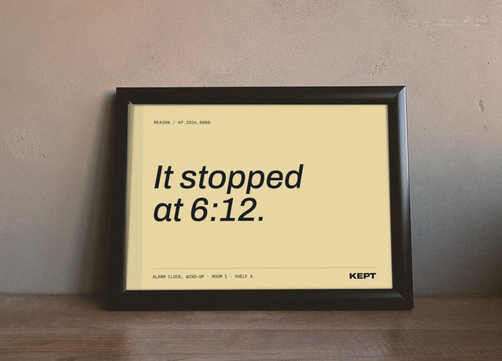
The brief we wrote ourselves
We wrote the fictional client's request in three lines, the way a small institution actually would:
Feel like a real institution, not a craft fair or a gift shop.
Run on a small budget: a rubber stamp, a risograph, one sign outside.
Get people to actually write. Without the reasons there is no collection.
The third line is the hard one. Most identity work is about being seen. This one had to be about making a stranger pick up a pencil.
What the category already does
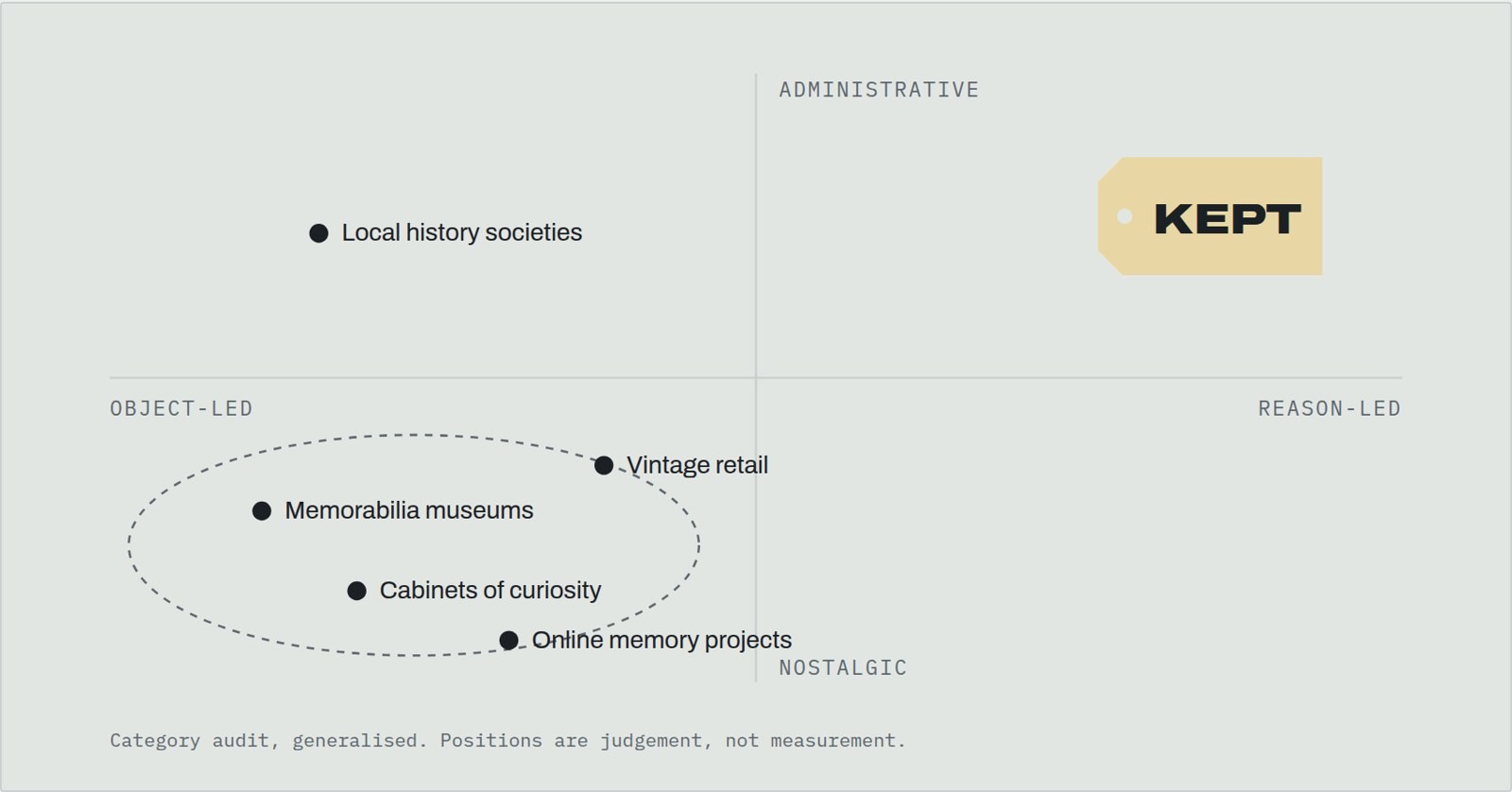
Before drawing anything we looked at how memory projects, memorabilia museums and nostalgia brands treat ordinary things. The pattern was consistent enough to be useful. Almost everyone leads with the object, and almost everyone dresses it in nostalgia: sepia, script typefaces, cabinets of curiosity, warm grain.
That language says this is precious. Our objects are not precious. A transit transfer from 1998 is worth nothing. Dressing it up would be a lie, and visitors would feel it.
The empty corner of the map was the administrative one: the language of the people who actually handle collections.
The insight: people keep reasons
The sentence that unlocked the project was short. People don't keep things. They keep reasons. The object is only the evidence. The reason is the part nobody else has.
If that is true, the museum should collect the reason and file the object. So we went looking at how museums file things.
Borrowing from the registrar
Museum registrars are responsible for knowing exactly what a collection holds and where. Their tools are unglamorous and precise: accession numbers, object tags, the deed of gift that transfers ownership, condition reports. The standard reference for this work in the United States is Museum Registration Methods, published by the American Alliance of Museums (6th edition, edited by John E. Simmons and Toni M. Kiser, 2020).
The object tag is the detail that mattered most. Everything that enters a collection gets a small numbered tag tied to it. It is the most ordinary object in any museum, and it is attached to every other object.
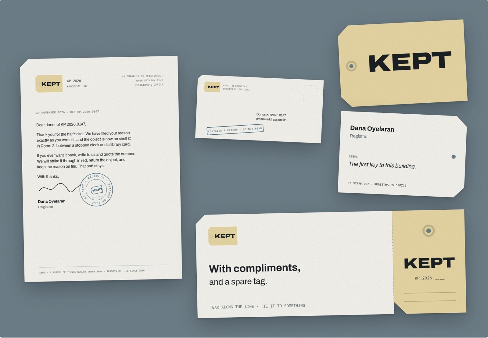
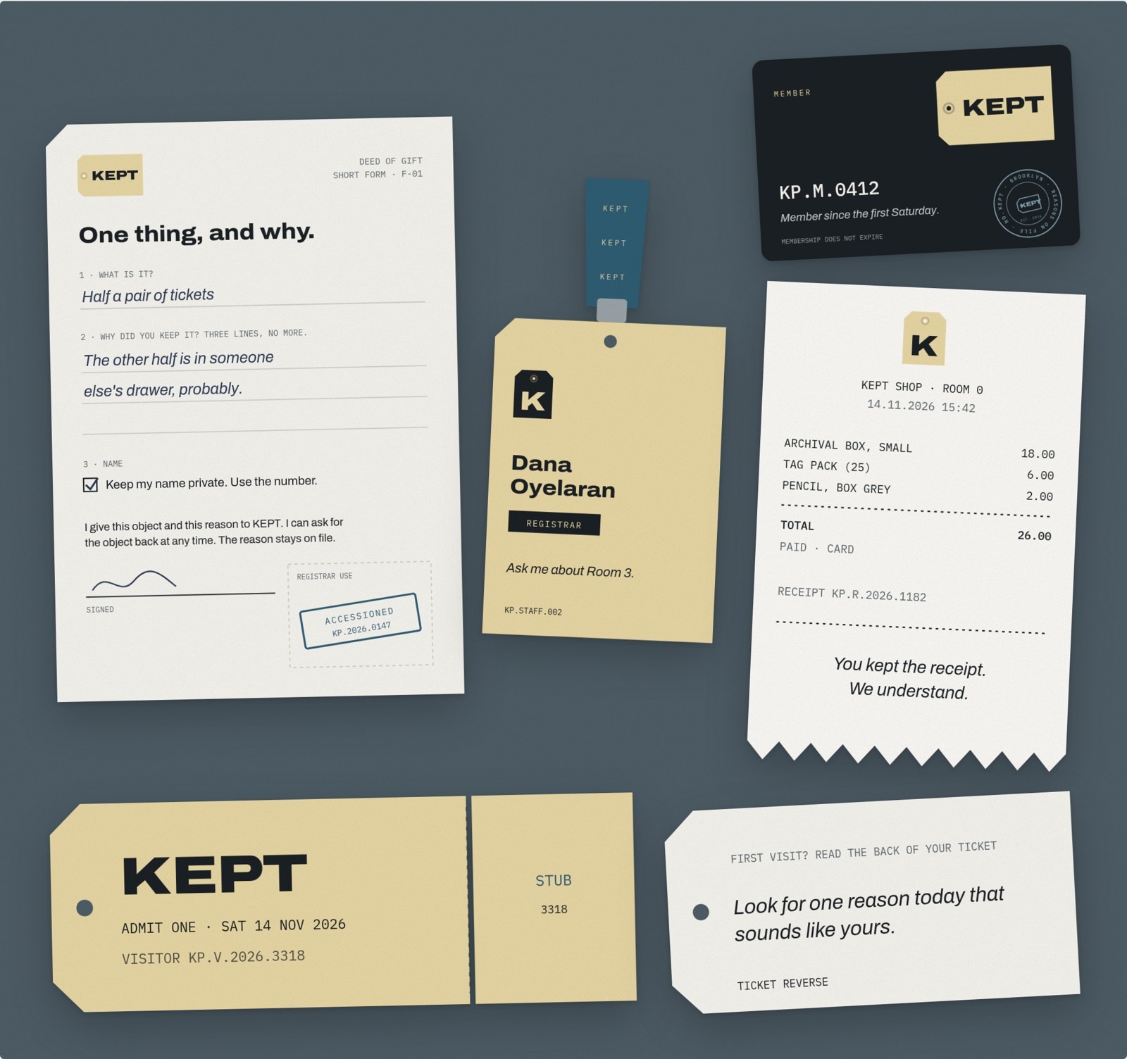
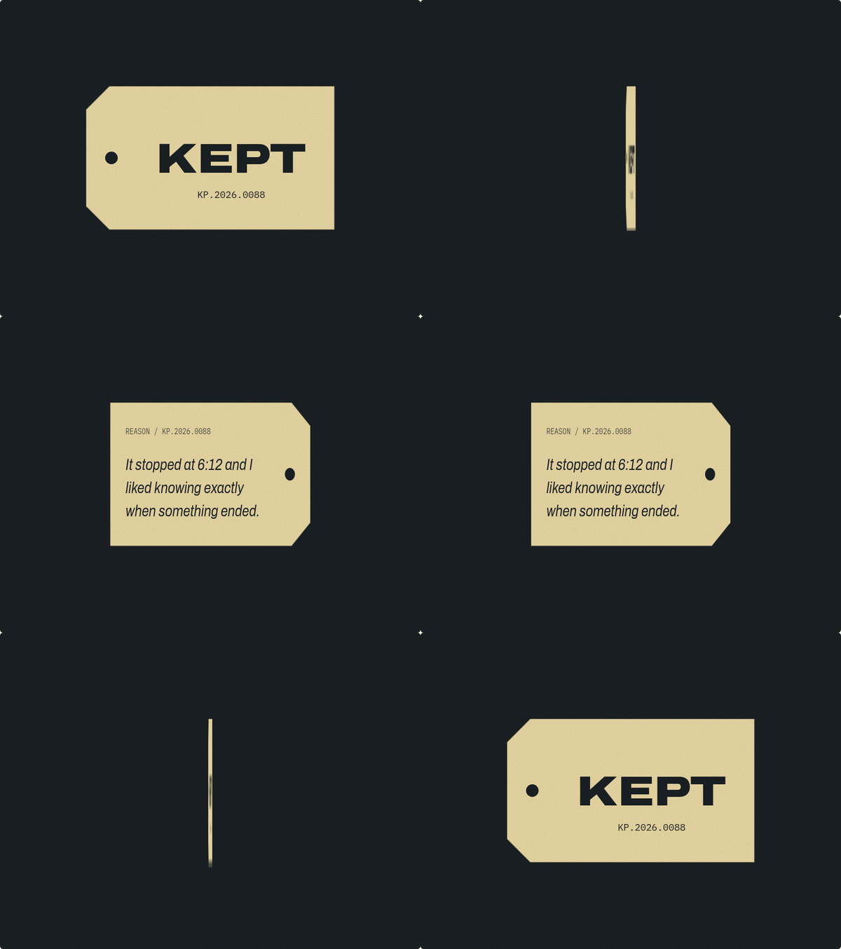
That became the idea: the tag is the institution. The logo is a tag. The entry ticket is a tag. The wall caption is cut like a tag. The sign outside is a tag hung on two strings. The front carries the name and the accession number. The back carries the reason, in the donor's own words.
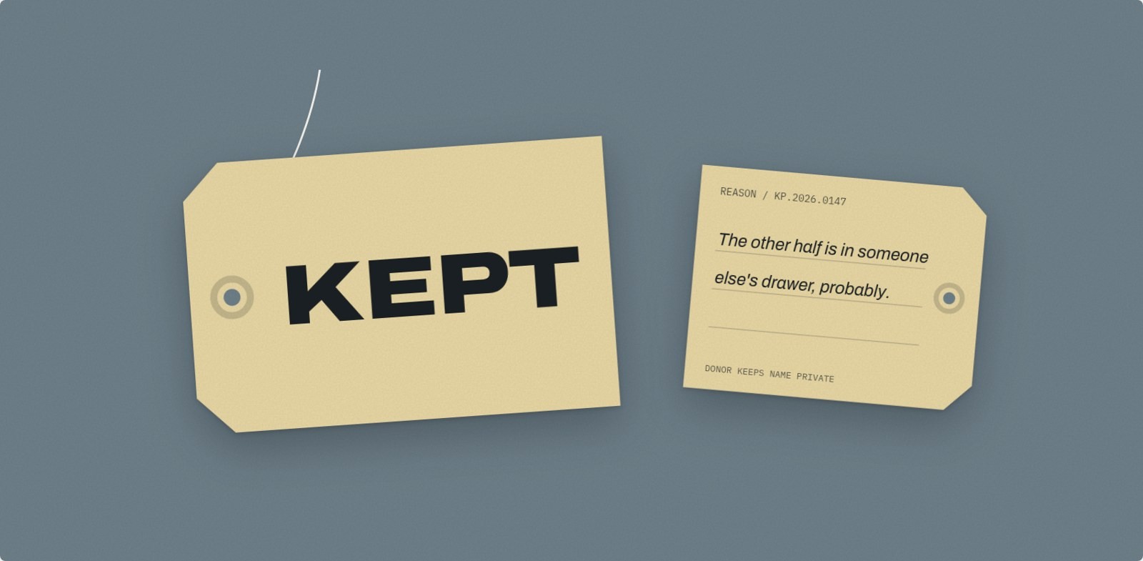
A reason that needs a paragraph is usually a story. A reason that fits three lines is usually the truth.
The reverse of every tag is ruled for three lines and no more. When a reason runs long, the museum does not edit it. The donor gets a fresh tag and tries again. We think this is the most important rule in the system, because it puts the editing in the hands of the person who owns the memory.
A number instead of a tagline
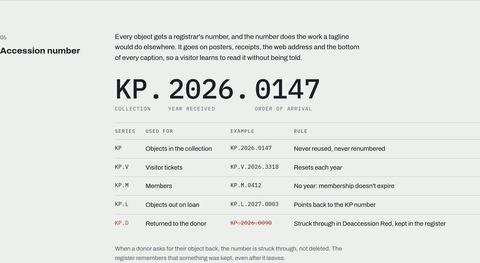
Real accession numbers usually encode the year an object arrived and its order of arrival. We adapted that into KP.2026.0147: collection, year received, order of arrival. The number goes on posters, receipts, captions and the confirmation screen of the donation flow. It does the job a tagline would do elsewhere, and visitors learn to read it without being told.
The number system extends to visitors (KP.V), members (KP.M) and loans (KP.L). When a donor asks for an object back, the number is struck through in red and stays in the register. The museum remembers that something was kept, even after it leaves.
Colour from the storeroom
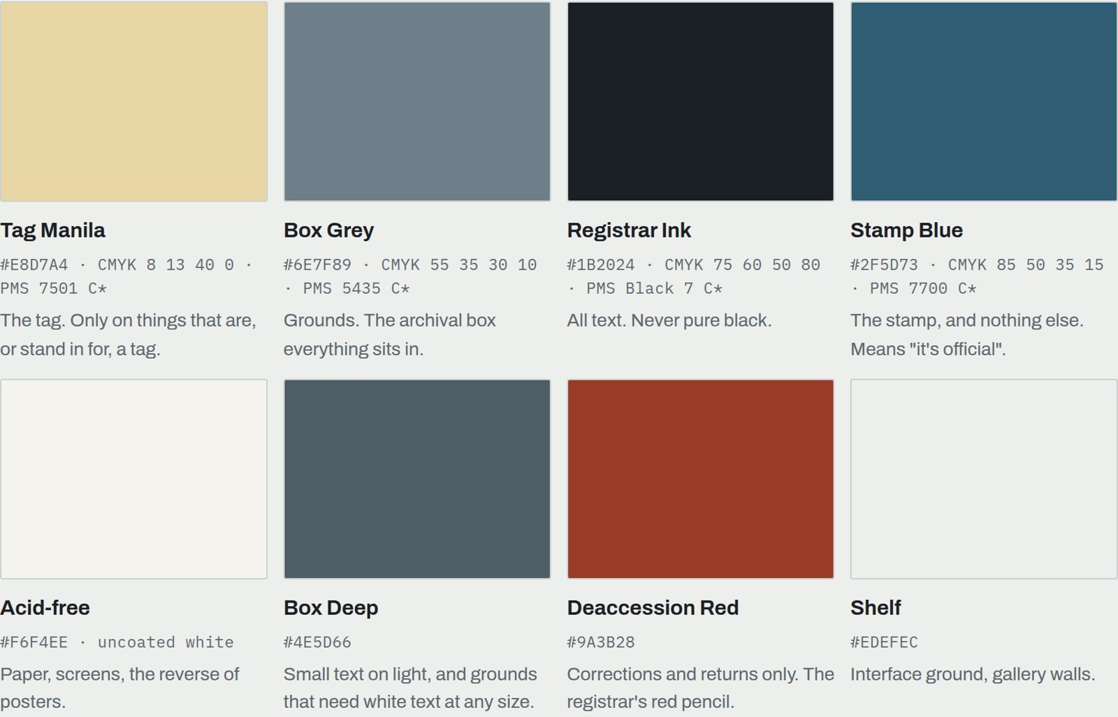
Every colour in KEPT is a material a registrar handles: manila tag stock, the blue-grey of archival boxes, registrar's ink, the blue of a rubber stamp, and a red that only appears when something is corrected or returned. Each colour has exactly one job.
We checked every text pairing against the WCAG 2.1 contrast thresholds of 4.5:1 for body text and 3:1 for large text. Ink on manila measures 11.5:1. White on box grey measures 3.8:1, so it is allowed only for large type. Manila on box grey measures 2.9:1 and is never used for text at all, even though it is the most obvious pairing in the palette. That single number ended up shaping a lot of the applications.
One typeface, three voices
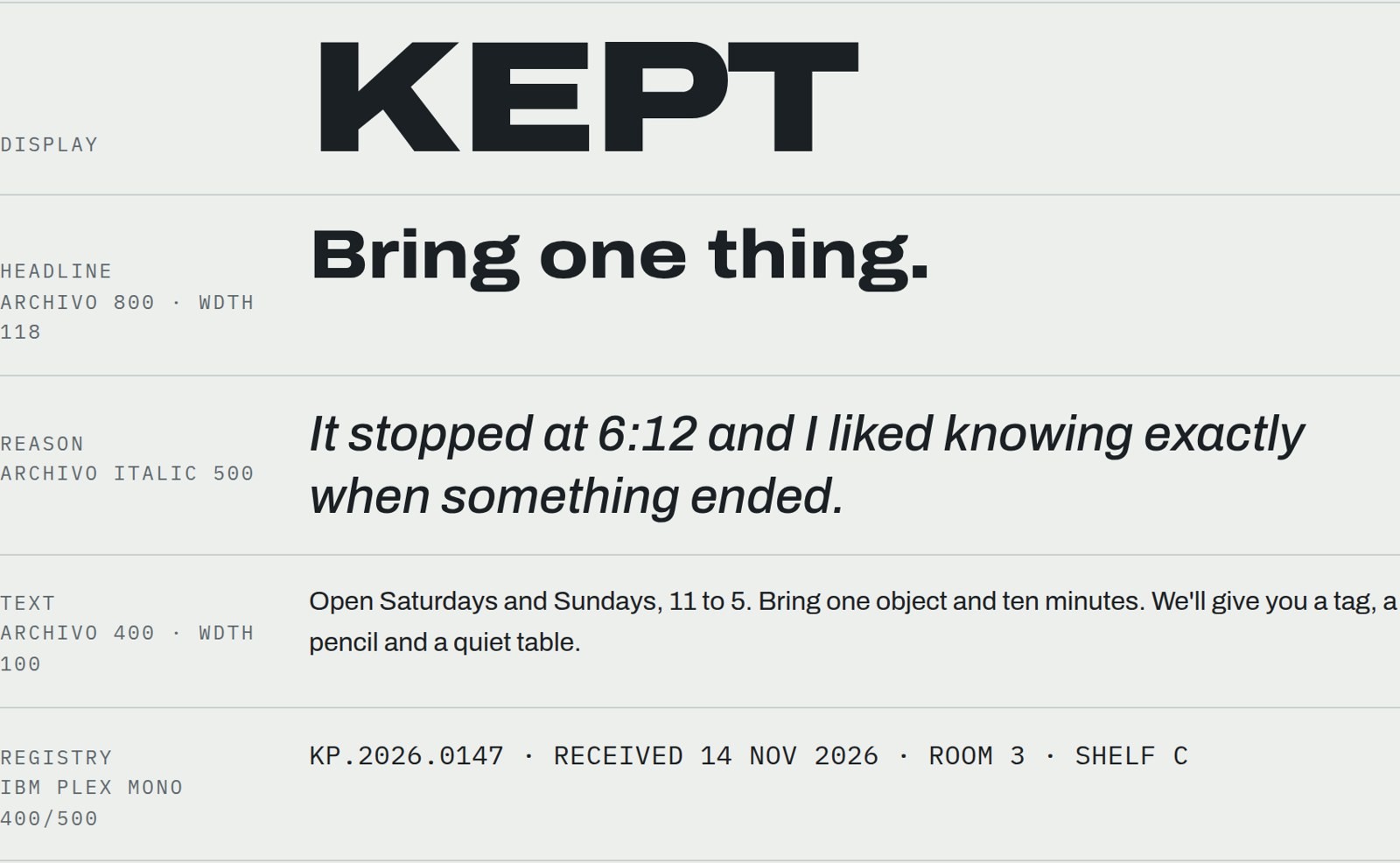
The system uses one family, Archivo by Omnibus-Type, which is released under the SIL Open Font License and has a variable width axis. At its widest and heaviest it reads like a stencilled crate, which became the wordmark. IBM Plex Mono handles the registry: numbers, dates, room names.
The rule that made the type system work was about italics. The donor's words are the only italic in the entire identity. Museum copy is upright, registry text is mono, and reasons lean. You can recognise a reason before you read it.
Writing like a registrar
The museum speaks in short administrative sentences. "Bring one thing." "Closed Mondays." "Received 14 Nov 2026." No adjectives like treasured or nostalgic. All of the feeling in the system is left to the reasons, which are printed exactly as written.
The receipt from the museum shop ends with one line that we suspect people would photograph: You kept the receipt. We understand.
Applications
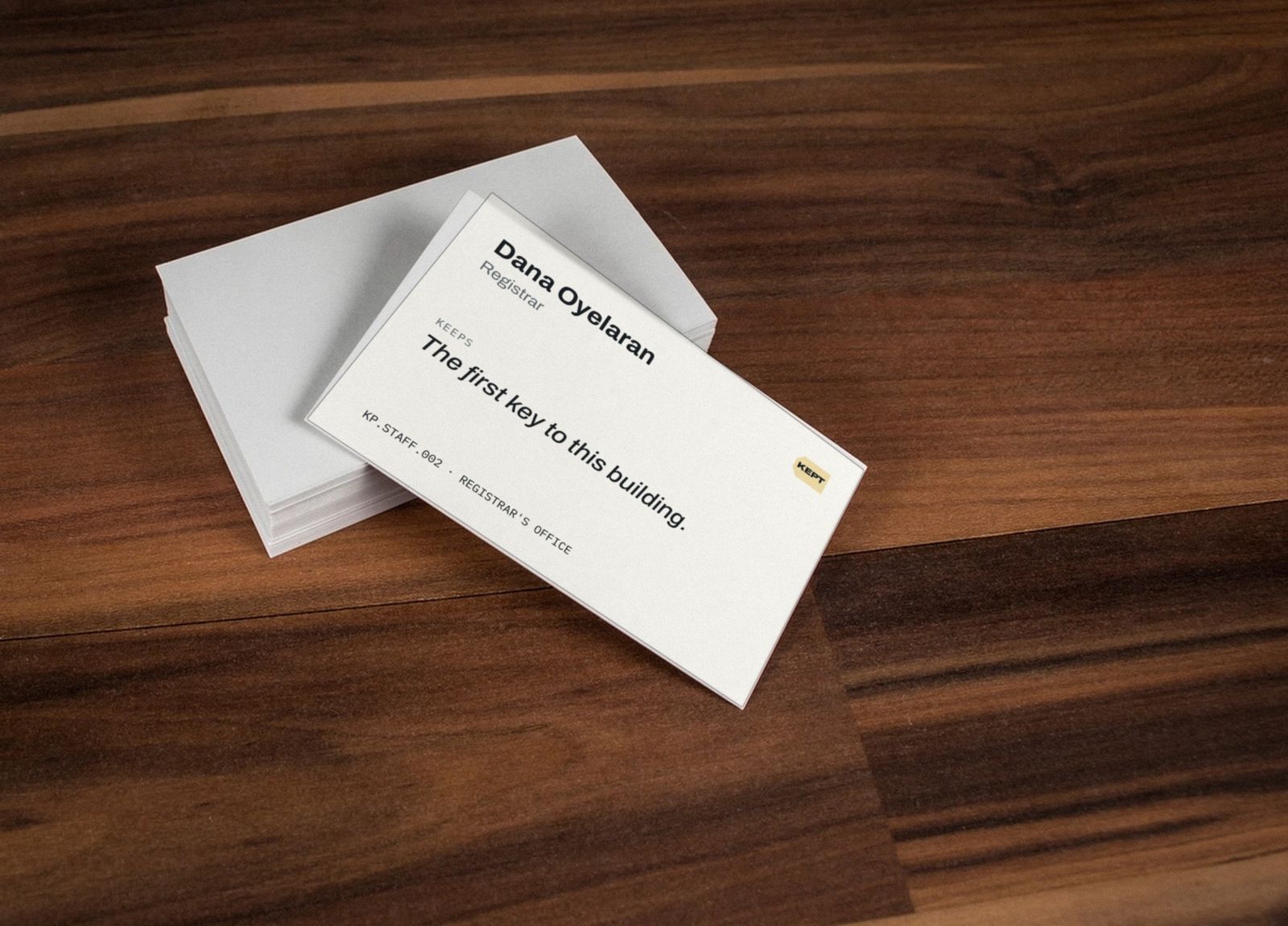
With the tag, the number, the palette and the three voices in place, the applications mostly designed themselves. Staff business cards carry, on the back, the one thing that person has kept. The deed of gift was designed first, since it is the most important object in the building. Rooms are named for kinds of keeping instead of themes: things kept by accident, things kept for later, things kept for someone else, things kept against advice.
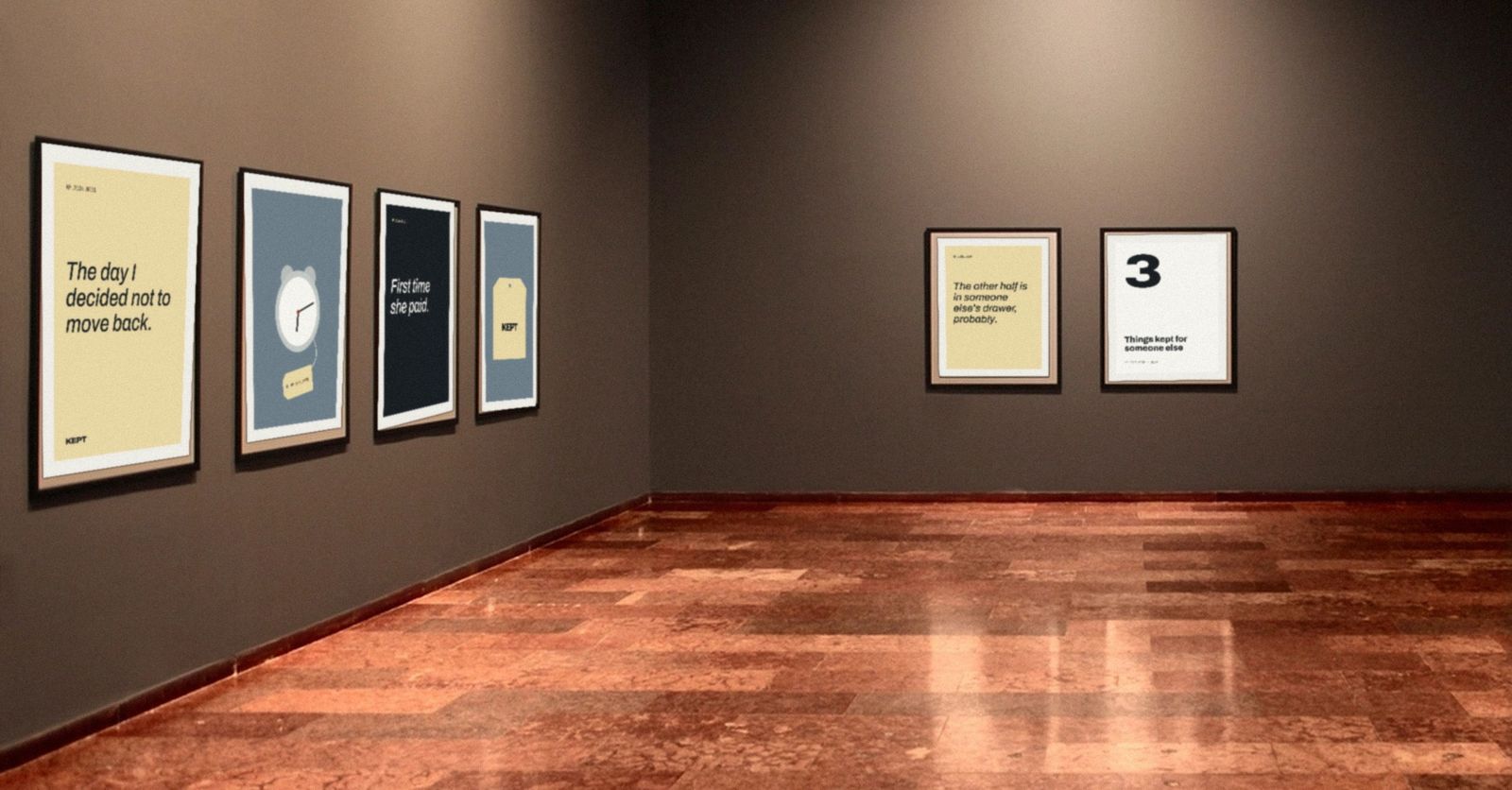
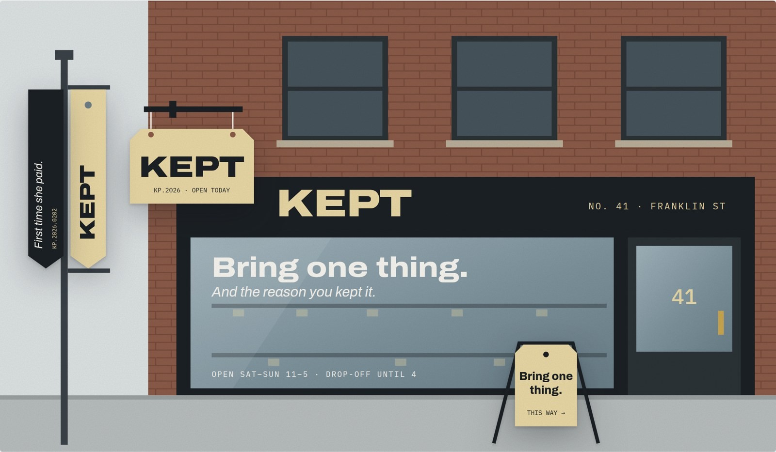
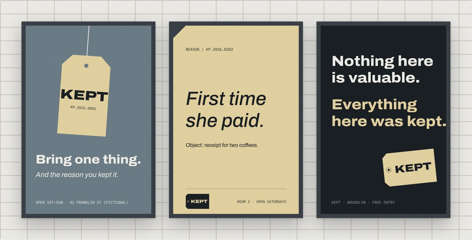
The opening campaign is three posters and five hundred blank tags tied to fences and benches around the neighbourhood. The back of each tag is empty on purpose. Fill it in, bring it to the desk, and it becomes your entry ticket.
Online, donating takes three steps: name the object, give the reason in three lines, get a number. The line counter is text, not a colour, so it works for everyone.
Motion that a string could do
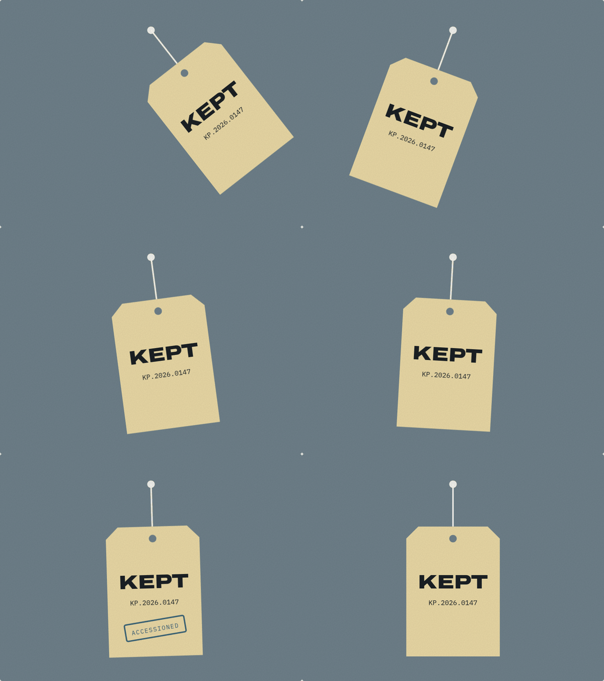
We allowed four movements, all borrowed from what a tag physically does: it swings and settles, it turns over to show its reason, its number rolls forward, it drops into place on a string. The rule was simple. If an object could not do it on a string, the identity does not do it on screen.
What we would test if KEPT were real
A self-initiated project can prove that a system is coherent. It cannot prove that it works with people. If KEPT were commissioned, the next steps would be press proofs for the print colours, a full-size mock-up of the blade sign on site, an accessibility walk-through of the wayfinding, and one experiment we care about more than the rest: asking twenty first-time donors to write a reason in three lines, and seeing how many come back for a second tag.
That last test is the whole idea in miniature. The identity is not trying to make ordinary objects look valuable. It is trying to give people a small, official place to say why something mattered.
The full case study, with the brand guidelines, misuse rules, pictograms and every application, is in our projects.
Credits and sources
Concept, strategy and direction: Keon Hwui Kim. Production: Moc Mallen Design Team. Made with AI tools under direction.
KEPT is a self-initiated concept. The address, staff, donors, prices and accession numbers are invented.
John E. Simmons and Toni M. Kiser (eds.), Museum Registration Methods, 6th edition, American Alliance of Museums, 2020.
W3C, Web Content Accessibility Guidelines (WCAG) 2.1, contrast minimum (Success Criterion 1.4.3).
Typefaces: Archivo (Héctor Gatti and Omnibus-Type) and IBM Plex Mono (IBM), both under the SIL Open Font License.
In-situ photographs are composites on CC0 stock images from StockSnap and rawpixel, found through Openverse.
Latest Articles.
© Moc Mallen Studio
Thoughts, ideas, and perspectives on design, simplicity, and creative process.

