The Helvetica and Arial Question, Settled Properly
The letterform tells, the 1982 origin, the licensing history that put Arial on every machine, and the honest answer that the argument is about defaults rather than taste.
Date
Category
Writer

Look at the top of a lowercase t. If the tip of the ascender is sliced off at an angle, you are looking at Arial. If it is cut square across, you are looking at Helvetica. That single stroke, about half a millimetre long at reading size, is the cleanest tell between the two typefaces, and almost nobody in the twenty-five-year argument about them has been arguing about it.
The argument is usually framed as taste: Helvetica is the good one, Arial is the cheap knock-off, and using Arial marks you out. Very little of that survives contact with the record. Arial was not made by Microsoft, was not made to copy Helvetica's shapes, and did not win because designers preferred it. It won because of an engineering property called metric compatibility, which exists specifically so that a document can be laid out without paying anyone a licence fee. What follows is the history, with dates, and then the letterforms, with a table.
Where Helvetica came from
The typeface was drawn at the Haas'sche Schriftgiesserei, the Haas Type Foundry, in Münchenstein near Basel. Wikipedia's account, which is careful and sourced, contains both of the dates you will see quoted: it says the first version "was designed in 1956 by Max Miedinger" and also that the typeface was "developed in 1957 by Swiss typeface designer Max Miedinger and Eduard Hoffmann". Both are defensible. Drawing began in 1956; the release belongs to 1957.
The credit is routinely given to Miedinger alone, and that is the first thing worth correcting. Hoffmann was the president of the foundry and directed the project; Miedinger was a freelance designer who had previously worked as a Haas salesman. The design was not conjured out of Swiss air either. Its primary model was Akzidenz-Grotesk, the nineteenth-century Berthold sans, and Hoffmann's design scrapbook shows, in Wikipedia's phrase, "careful comparison of test proofs with snippets of Akzidenz-Grotesk". The stated goal was a face "that could compete in the Swiss market as a neutral face that should not be given any additional meaning".
It was called Neue Haas Grotesk. It was not called Helvetica until 1960, and the renaming was a marketing decision taken in Germany, not Switzerland: "In 1960, Stempel (the German parent company of Haas) changed the typeface's name to Helvetica, to make it more marketable internationally." Helvetia is the Latin name for the region; the adjectival form was chosen because Swiss neutrality sold well abroad. Stempel and Linotype then adopted the design for hot metal composition, which was how body text was set at the time, and that is the route by which a small foundry's face became an international product.
One date that matters for context: Adrian Frutiger's Univers was released the same year. Helvetica did not arrive into an empty market. It arrived into a fight, and the 1960 rename was part of how it won.
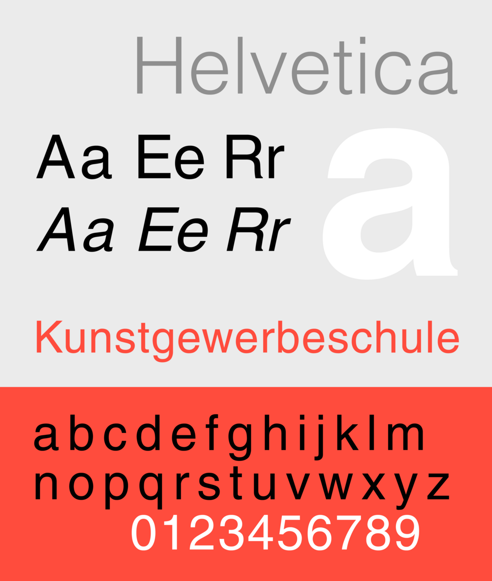
A Helvetica specimen. Public domain, via Wikimedia Commons.
Where Arial came from, which is not where you think
The widely repeated story is that Microsoft commissioned a Helvetica lookalike to avoid paying Linotype. Every part of that sentence is either wrong or unproven.
Arial was drawn in 1982 by Robin Nicholas and Patricia Saunders at Monotype, for IBM. The reference account puts it plainly: the typeface was created for IBM's 1982 office publishing initiative, and IBM commissioned bitmap fonts for two specific machines, "the 240-DPI 3800-3 laserxerographic printer, and the 600-DPI 4250 electro-erosion laminate typesetter". Microsoft licensed it ten years later.
Nicholas said so himself, at length, in an interview with John L. Walters and Simon Esterson published in Eye (issue 84, Autumn 2012). On the client: "The first contracts were for the IBM 3800 laser printer, which was a huge thing that was used by a lot of aircraft companies." On the brief: "They were looking for a set of core fonts. That's where Arial started, as a bitmap font." On the method, which explains a great deal about the design's compromises: "Because the early Lasercomp fonts were high-resolution bitmap fonts we were able to use that as a starting point and sample down that data and then hand edit it to give us 240dpi or 300dpi fonts."
And on the typeface's status, a remark I find more honest than most designers would manage about their most famous work:
I don't really see Arial as my typeface. It was a product of its time. It was a way of filling a company need.
Paul Shaw's research in Blue Pencil no. 18 fills in the rest. Matthew Carter, then consulting for IBM's Printer Planning Division, supervised bitmap corrections. Carter is quoted there: "Arial was originally called Sonoran Sans during its development but I believe that IBM used the name Arial by the time it was released." The Canadian type designer Rod McDonald, who worked with Monotype, states the lineage: "Arial was definitely based on the Monotype Grotesques...based on Berthold's Ideal Grotesk...based on Venus." Monotype's own unfinished New Grotesque, begun in 1956, was also used as a model.
That lineage is real and checkable. Monotype Grotesque series 215 (regular, with oblique) and 216 (bold) were released in 1926, credited to Frank Hinman Pierpont, and were themselves drawn in response to Venus from the Bauer foundry and Ideal from Berthold. The Monotype Grotesque page states the connection directly: "Monotype would later use aspects of Monotype Grotesque and New Grotesque as an inspiration for Arial, a new design styled to generally be very similar to Helvetica."
Mark Simonson, whose 2001 essay The Scourge of Arial is the single most influential piece of writing on this subject, describes Arial as "a loose adaptation of Monotype's venerable Grotesque series, redrawn to match the proportions and weight of Helvetica", and notes that "it appears that Monotype was uncomfortable about doing a direct copy". That is the correct description. Arial is not a traced Helvetica. It is Monotype's own family, stretched onto Helvetica's measurements.
What "metrically compatible" actually means
This is the part of the story that does the causal work, and it is usually skipped because it sounds like a technicality.
Every character in a font has an advance width: the horizontal distance the cursor moves after setting it. Line breaks, justification and page count are all functions of those numbers. If two fonts share every advance width, a document set in one can be rendered in the other and every line will break in exactly the same place.
The reference description of Arial says "the changes cause the typeface to nearly match Linotype Helvetica in both proportion and weight" and to "perfectly match in width". The Helvetica article puts the same fact from the other side: Arial "is metrically identical to the PostScript version of Helvetica". Simonson describes the practical result: it "was possible to automatically substitute Arial when Helvetica was specified in a document printed on a PostScript clone output device".
Read that last sentence slowly. The entire commercial purpose of the design is contained in it. Arial exists so that a machine that has not licensed Helvetica can print a Helvetica document. It is not a homage and it is not a parody. It is a substitution mechanism with letterforms attached.
The letterform tells
Simonson published two pieces on 21 February 2001: the polemic, and a companion, How to Spot Arial, which is the identification guide everyone has quietly used ever since. These are his distinctions, in his terms.
Character | Helvetica | Arial |
|---|---|---|
Lowercase t | The top of the stem is "cut off straight" | The top of the stem is "cut off at an angle" |
Capital S and C | Stroke endings are "perfectly horizontal" | Endings are "cut off at a slight angle", as in Monotype Grotesque |
Capital G | Has "a spur at the bottom of the stem on the right side"; the curve flows into the stem | "No spur and the curve at the bottom meets the stem at an angle" |
Capital R | The leg "flows out from the bowl and curves straight down, ending in a slight curve to the right" | The leg "flows down and to the right from near the center of the horizontal bar and straightens out at an angle to the end" |
Lowercase a | Has a tail; the bowl "flows into the stem like a backwards 's'" | No tail; the bowl "simply intersects the stem with a slight curve" |
Two practical notes on using this. The R is the tell that works at the largest number of sizes, because the leg is a long stroke and its angle survives at small point sizes where the t's cut does not. The lowercase a is the tell that works in running text, because a is common and the tail is either there or it is not. The G is the tell that works in a logotype, because you are usually looking at a capital at large size.
How Arial got everywhere
The distribution history is short and decisive. In 1992 Microsoft made Arial one of the four core TrueType fonts shipped with Windows 3.1. McDonald dates and describes the deal: "In 1992 the TrueType version of Arial was licensed to Microsoft as one of the core fonts for use on their new Windows 3.1 OS."
Then, in 1996, Microsoft launched Core fonts for the Web, which offered eleven typefaces as free downloads for any platform: Andalé Mono, Arial, Arial Black, Comic Sans MS, Courier New, Georgia, Impact, Times New Roman, Trebuchet MS, Verdana and Webdings. They were freeware under a restrictive licence: redistribution was permitted only if the packages kept their original format and filenames and were not used to add value to a commercial offering. Microsoft ended the programme in August 2002, saying the downloads were being repackaged, modified and shipped with commercial products in breach of the licence, and that most users who wanted the fonts already had them. The programme's death changed nothing, because by then the fonts were installed on essentially every desktop in the world and baked into the default stacks of the web.
Helvetica, meanwhile, remained a licensed product. PostScript does not mandate a font set, but Arial and Helvetica are both among the roughly forty typeface families a PostScript Level 3 device typically supports. Mac OS X was the first Apple operating system to ship Arial as well.
The symmetry is worth stating: Helvetica became ubiquitous through a licensing business, and Arial became ubiquitous through a giveaway. Neither became ubiquitous through anyone's aesthetic judgement.
The cheapness story I cannot verify
Here is the claim that everyone repeats, including me, until I went looking for a source. Simonson writes that when "Microsoft made TrueType the standard font format for Windows 3.1, they opted to go with Arial rather than Helvetica, probably because it was cheaper."
Note the word "probably". Simonson is speculating, openly and honestly, and twenty-five years of retelling has quietly promoted his guess to a fact. I have not found a primary source, a contract, a Microsoft statement or a Linotype statement, that establishes price as the deciding factor. And there is a counter-indication from someone close to it: Rod McDonald, quoted by Paul Shaw, says that "the amount of money Microsoft paid over the years for the development of Arial could finance a small country". That is hyperbole, but it is hyperbole in the opposite direction from "cheaper".
The likelier explanation, and the one the engineering supports, is that Microsoft wanted metric compatibility with Helvetica plus a supplier it could commission extensions from, at a time when it was building a font format and needed a family it could grow into hundreds of glyphs and dozens of scripts. Monotype could be directed. Linotype's Helvetica came as it was. But I want to be clear that this is my reading of the incentives and not something I can cite.
Why the argument is really about defaults
Set the two typefaces at eleven point in a paragraph of running text. Unless you are hunting for the a and the t, you will not reliably tell them apart, and neither will your reader. Almost every published comparison is set at seventy-two point or larger, which is the size at which the differences are obvious and the size at which nobody sets text.
So what is the argument about? Three things, none of them taste.
It is about provenance. Helvetica was made by a foundry as a considered product and sold as one. Arial was made to fill a gap in IBM's printer line, by Nicholas's own account, and was assembled from a family Monotype already owned. Designers can smell the difference in intent even when they cannot see the difference in the letters.
It is about money. Helvetica is something you buy. Arial is something you already have. A profession that sells judgement has an obvious interest in maintaining that the thing you pay for is better, and an equally obvious blind spot about saying so.
And it is about defaults. Between 1992 and 2002 a single company put one of these typefaces on every machine on earth for nothing, and the other stayed behind a licence. Everything downstream of that, the ubiquity, the contempt, the identification guides, the twenty-five-year argument, is a consequence of a distribution decision made for reasons that had nothing to do with how a capital R should end.
The honest position is narrow. Arial is a competent typeface with a duller G and a worse R than Helvetica, drawn under constraints its designer described accurately as "a way of filling a company need". If you want the Swiss face, buy it, and know that you are buying a 1957 drawing with a 1960 marketing name. If you use Arial, use it deliberately and set it well. What you should not do is repeat the claim that Microsoft invented it to copy Helvetica. IBM asked for it, in 1982, for a laser printer used by aircraft companies.
Sources
Mark Simonson, "The Scourge of Arial", marksimonson.com, 21 February 2001. www.marksimonson.com/notebook/view/the-scourge-of-arial
Mark Simonson, "How to Spot Arial", marksimonson.com, 21 February 2001; source of the letterform distinctions tabulated above. www.marksimonson.com/notebook/view/how-to-spot-arial
John L. Walters and Simon Esterson, interview with Robin Nicholas, Eye magazine, issue 84, Autumn 2012. eyemagazine.com/feature/article/robin-nicholas
Paul Shaw, "Blue Pencil no. 18: Some history about Arial", paulshawletterdesign.com, September 2011; includes quotations from Matthew Carter and Rod McDonald. www.paulshawletterdesign.com/2011/09/blue-pencil-no-18%E2%80%94some-history-about-arial/
"Arial", Wikipedia; commissioning by IBM for the 3800-3 and 4250, designers, metric compatibility, Windows 3.1 and Core fonts for the Web, PostScript Level 3, Calibri in Office 2007. en.wikipedia.org/wiki/Arial
"Helvetica", Wikipedia; Haas'sche Schriftgiesserei, Miedinger and Hoffmann, 1956 and 1957 dating, Akzidenz-Grotesk, the 1960 Stempel renaming, Univers, and the metric identity of Arial to PostScript Helvetica. en.wikipedia.org/wiki/Helvetica
"Monotype Grotesque", Wikipedia; series 215 and 216 (1926), Frank Hinman Pierpont, Venus and Ideal, and the relationship to Arial. en.wikipedia.org/wiki/Monotype_Grotesque
"Core fonts for the Web", Wikipedia; the 1996 launch, the eleven typefaces, the licence terms and the August 2002 discontinuation. en.wikipedia.org/wiki/Core_fonts_for_the_Web
Related reading
Latest Articles.
© Moc Mallen Studio
Thoughts, ideas, and perspectives on design, simplicity, and creative process.


