Forms Are Not Interfaces
Most forms are built to function. Few are designed to guide. This piece explores how clarity, flow, and restraint turn forms into seamless decisions—rather than points of friction.
Date
Category
Writer

Forms Are Not Interfaces. They’re Decisions.
Forms are often treated as functional elements.
Something you add at the end—after the visuals, after the layout.
But in reality, forms are where intention gets tested.
It’s the point where a user decides:
Do I continue, or do I leave?
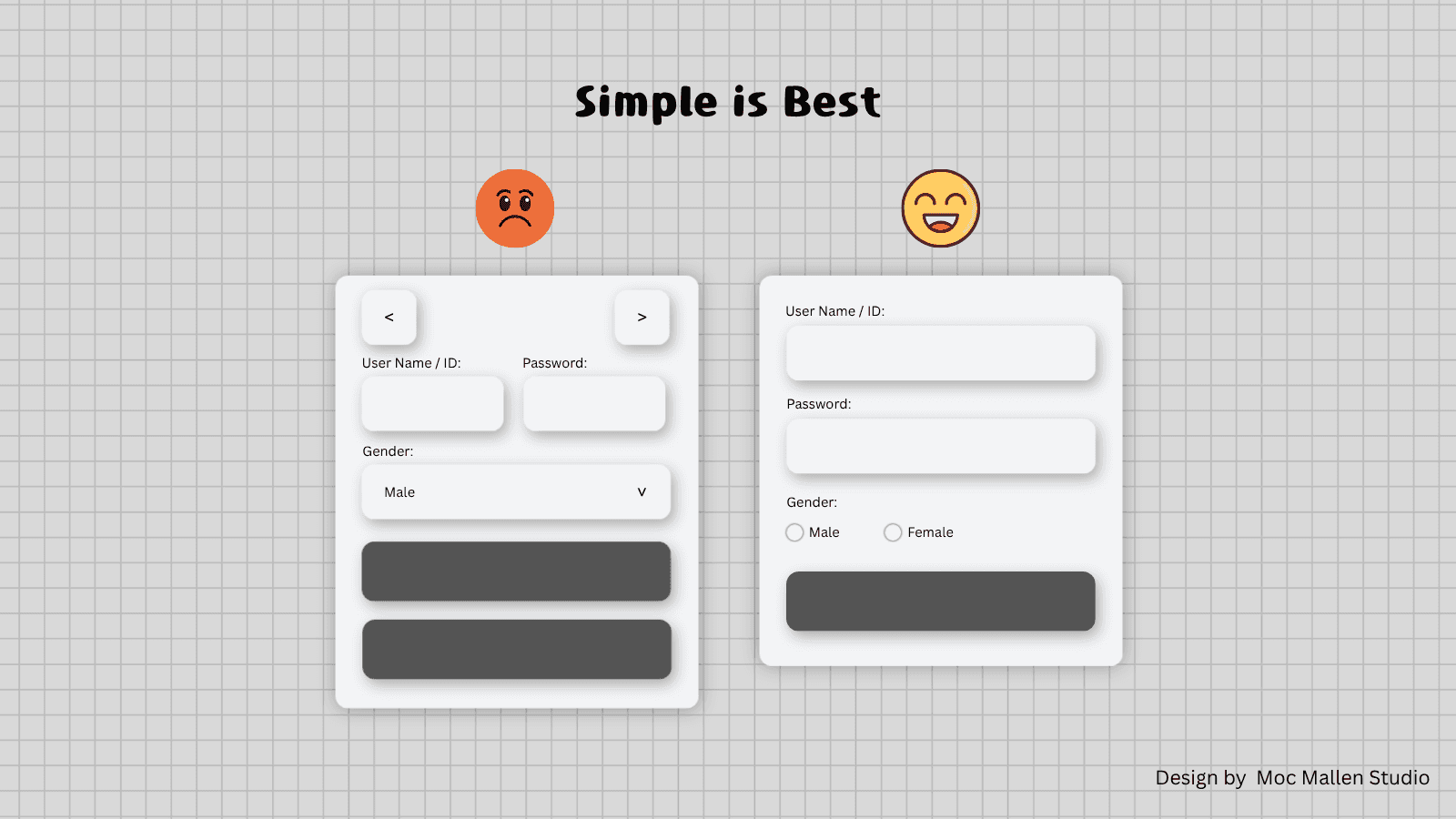
Clarity Is the Only UX That Matters
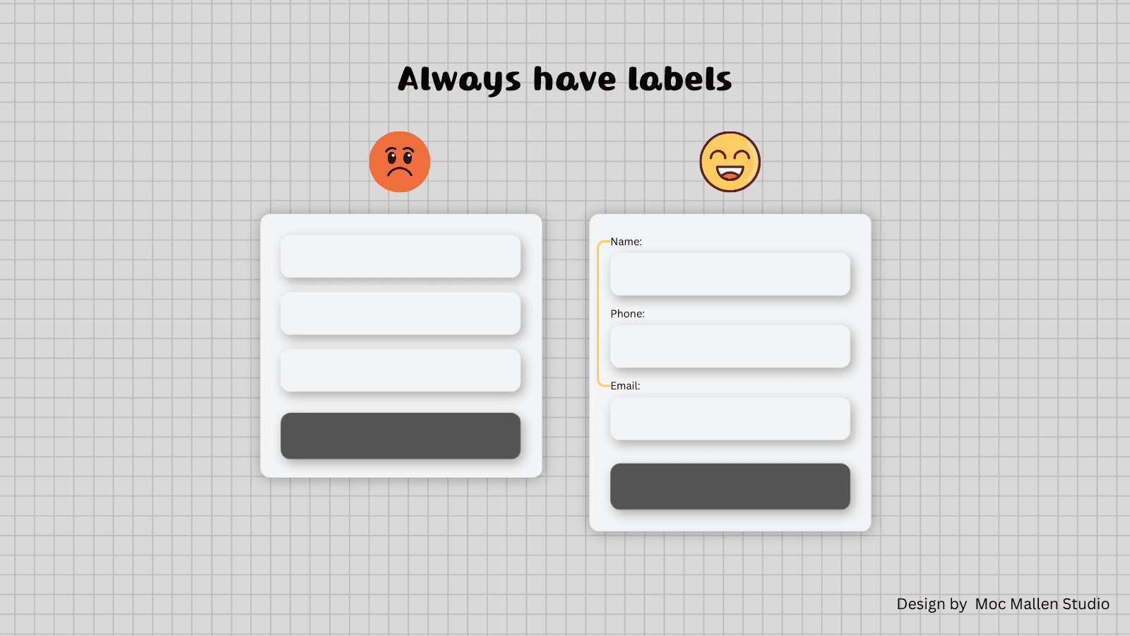
Most forms fail for one simple reason—
they ask, but they don’t guide.
Missing labels. Unclear structure. Hidden logic.
All of it creates hesitation.
And hesitation is friction.
A well-designed form doesn’t make users think.
It lets them move.
Flow Over Layout
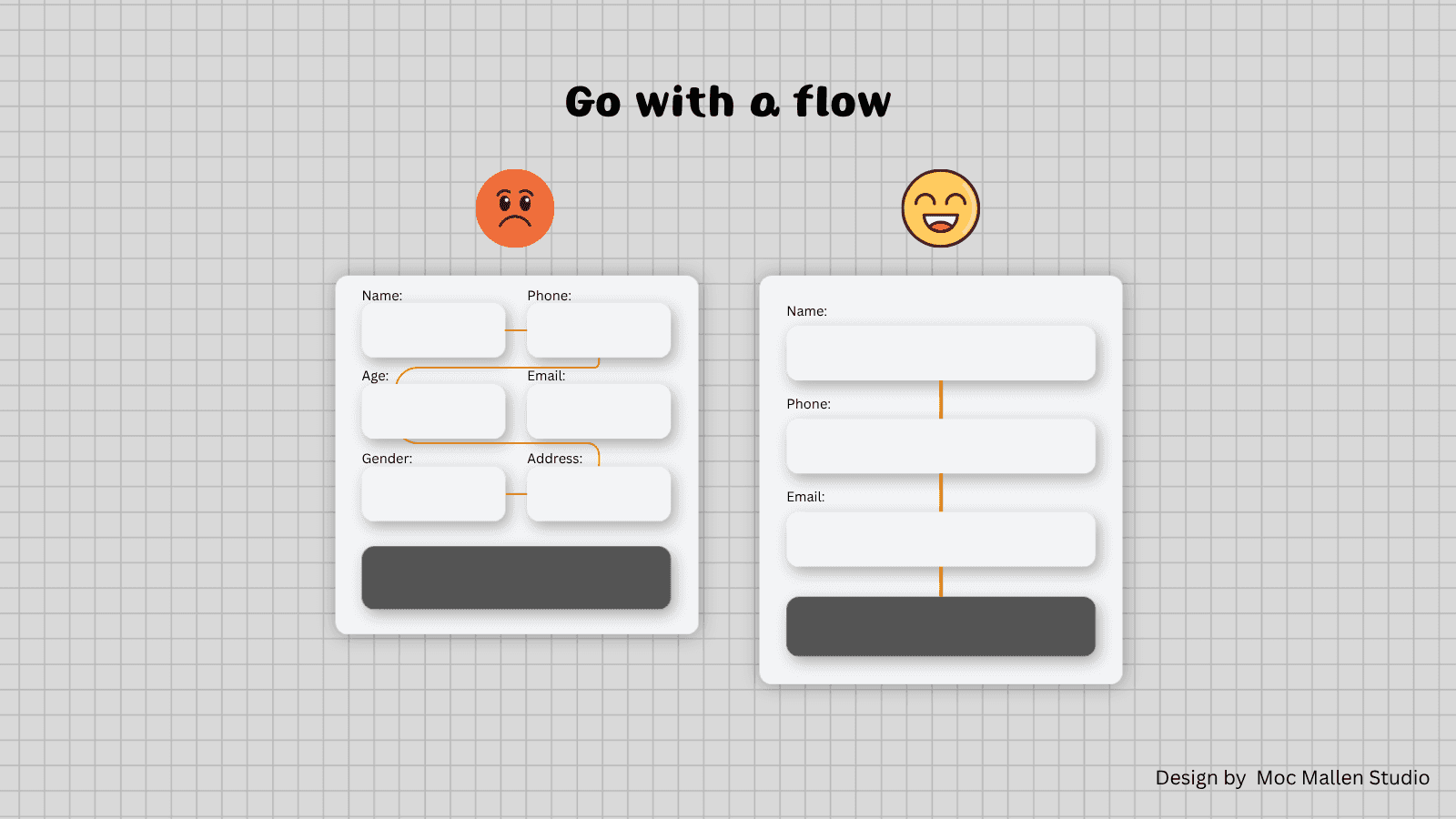
Designers often focus on how forms look.
Grids. Alignment. Symmetry.
But forms are not static compositions.
They are sequences.
Users don’t “see” a form.
They move through it.
One field. Then the next. Then the next.
When that flow is broken—
through poor grouping, awkward placement, or scattered actions—
the entire experience collapses.
Less Input, More Direction
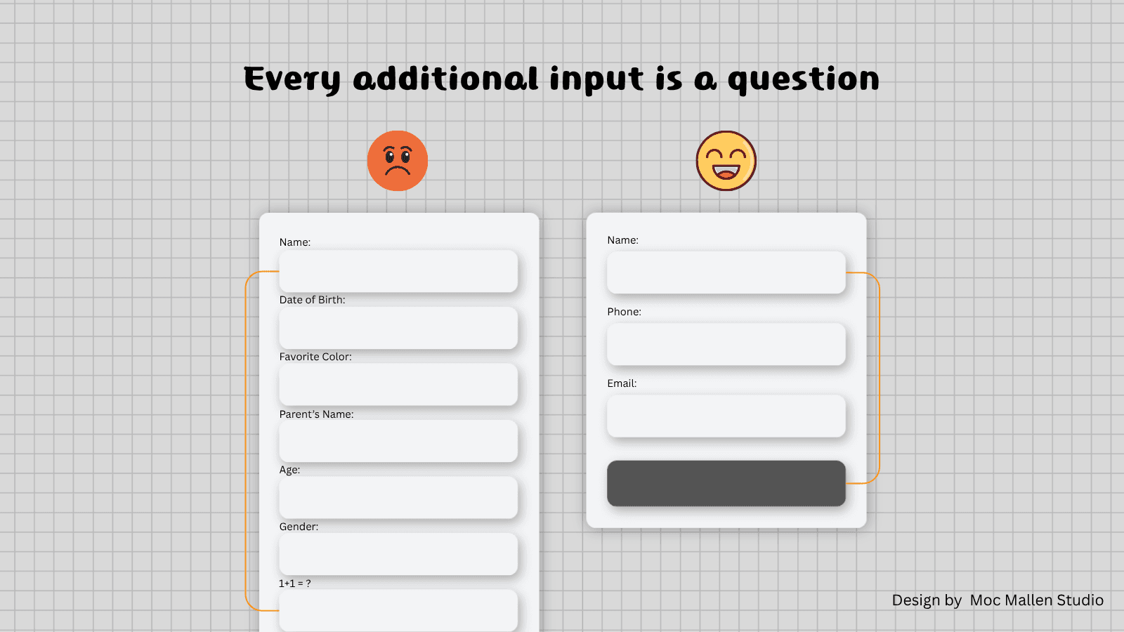
More fields don’t mean more value.
They mean more resistance.
Every additional input is a question.
And every question costs attention.
The goal isn’t to collect everything.
It’s to collect what matters—clearly, and without interruption.
Feedback Is Part of the Design
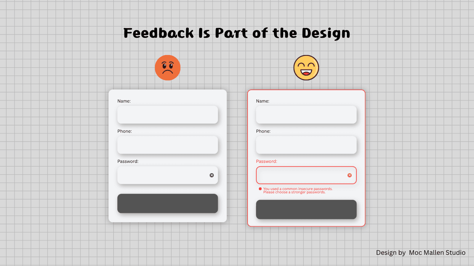
Errors, placeholders, constraints—
these aren’t edge cases.
They are part of the experience.
A vague error message is not a small mistake.
It’s a broken conversation.
A good form doesn’t just react.
It anticipates.
One Action, One Outcome
Too many forms try to do too much.
Multiple buttons. Confusing next steps. Generic actions.
“Submit” is not a meaningful word.
It says nothing about what happens next.
Every form should lead to one clear action.
And that action should feel intentional.
The Space Between Fields
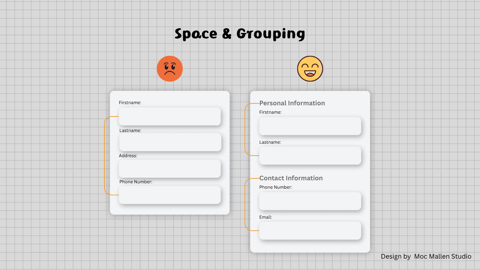
What sits between inputs matters as much as the inputs themselves.
Spacing creates rhythm.
Grouping creates meaning.
Without structure, everything feels equal.
And when everything feels equal, nothing stands out.
Closing Thought
A form is not just a tool for collecting data.
It’s a moment of trust.
Users give you their time, their information, their attention.
And in return, they expect clarity.
At Moc Mallen Studio, forms are not designed to function.
They are designed to feel inevitable.
Because the best interaction
is the one that doesn’t feel like a decision at all.
and don't forget to "Always Stay Happy."
Latest Articles.
© Moc Mallen Studio
Thoughts, ideas, and perspectives on design, simplicity, and creative process.

